MS Office for Under $10 and Legal: Are You Eligible?

Note: I realize this won’t apply to most people, but then again, it might be applicable to more than one would think. So in case it might help someone who wouldn’t otherwise be aware, I’m sharing how I got Microsoft Office, legally, on the cheap.

After my diatribe about Microsoft Word a few weeks ago, I ended up buying it. As noted in that blog post, OpenOffice is a great alternative to Office, but not a perfect one. So when I got an email at work saying I could purchase Office for my own use at home, for $9.95, I checked it out right away.

MS Office Pro PlusOf course, skeptic that I am, I thought it sounded too good to be true. But the email was from an official U.S. Air Force channel, and the link went to microsoft.com, so I clicked.

The offer comes from the Microsoft Home Use Program, which the U.S. Air Force participates in. Many other government agencies do too, as well as many private companies. I had no idea this was available to me until I saw it in a newsletter I get at work. Best of all, it’s available to on-site contractors as well as government employees.

From what I understand based on the information at the Microsoft Home Use Program, it looks like any company that participates in Microsoft’s Software Assurance Program and chooses to participate, can. The link above goes to a U.S.-specific site, but they may have programs in place for other countries, too. Some companies that are eligible to participate choose not to, in many cases due to misinformation.

Of course, there are a lot of terms and conditions. The main one to note is that, if you leave your eligible job, you’re supposed to discontinue using the software. It doesn’t have to be used just for work purposes, and the only information you need to supply is your work email (for the eligible company/organization), and the basics like your address.

I figured for $10*, why not? As I work on formatting my book for print, I’m finding a lot of details easier to implement in Word than OpenOffice, like sections, for instance. For most other word processing, I still use OpenOffice, because I prefer its menu-based interface. But if you work for a large company or government organization, it might be worth checking with your IT department to see if they offer this program!

*The $9.95 price is for a download. You can get the product on CDs, but it’s an additional charge of around $12 or so.

My Town Monday: History on the Hill

History on the Hill

They’ve been busy adding new features, exhibits, and fun things to see at Dayton’s Carillon Historical Park these past couple of years. Just this past weekend, the park opened several new exhibits, including the Carousel of Innovation. Last summer, they opened the History on the Hill exhibit in the old carriage house, and created a series of trails and steps on the bluffs behind the building. History on the Hill begins here.

Overlooking the Great Miami River, the bluffs were created as part of glacial recession from the last ice age. The Dayton area sits on the terminal moraine, which is the farthest point south reached by glaciers during the last ice age. The exhibits inside the building provide some drawings and details about this, as well as more recent history. For example, the park site belonged to NCR (The National Cash Register Company) prior to the park’s construction, and the area near the bluffs was used as a target shooting range.

Remains of a building on the trailThe trail winds up the hill and around the parking lot, close to South Dixie Drive. It then leads past the neighboring Calvary Cemetery, to a picnic shelter of sorts called an Andirondack hut. In the early 20th century, the bluffs also housed a sanitarium, where smallpox patients were quarantined. The remants of a floor here might have been part of this building, I’m not sure.

The trails are a neat little walk (I’m guessing the entire trail is maybe a mile, probably less). If you go, make sure you wear good shoes – there are several steep areas, and one of the staircases isn’t completed. For these reasons, the trails themselves aren’t suitable for people with mobility problems, although there is a ramp up to the building.

Near the end of the trail on the west side of the exhibit building is a long, corrugated, black plastic pipe of about 30 inches in diameter. It goes down a steep slope alongside one of the staircases for probably a couple dozen yards or so. The park map calls this the Glacial Adventure. It’s not suitable to slide down, so I’m not sure of the reasoning behind that name. There are also several areas of the trail that are obviously not yet complete, as they’re blocked off by caution tape.

Despite its not-quite-completeness in a few places, History on the Hill is a fun little diversion and is certainly worth a look next time you visit Carillon Park.

If you live in the Dayton area, have you check out History on the Hill yet? If not, do you have something similar in your area?

More at the My Town Monday blog

Little Details in Books: Do You Notice Them?

I’m not talking about story details; I’m talking about little, visual details – graphics, chapter headings, fonts.

I’ve been thinking about these details a lot because now that Time’s Enemy is out in digital format, I’m starting to work on the print version.

There are a lot of extra considerations to make when planning a print version. There’s a lot more to creating a print cover, but there are also many decisions for the book’s interior. Foremost is which font to use for the body text? And yes, there is life after Times New Roman. I considered Garamond, Palatino, and Book Antiqua, but finally settled on Caxton. It’s a really pretty font, is sort of a combination of old style with a modern flair, and gives the page a nice, even “color.” The main thing you’re looking for is readability, and for body text that’s going to be printed, that usually means a serif typeface. For those unfamiliar with graphic arts terms, “serif” means the typeface has little brackets on the ends of the letter strokes. All the fonts I’ve mentioned above are serif typefaces. Sans-serif fonts (i.e., fonts without serifs) include Arial, Verdana, and Trebuchet, and are better suited for headings or on-screen reading, such as web pages.

The print version of Time's Enemy is set in Caxton, with right-justified chapter headings

The next consideration is display type, or what font to use in chapter headings and on the book’s title page. This is a good place for decorative fonts, and book designers can have a lot of fun with these. For my print book, I’m leaning toward Belwe, which is the same display font as the title on the book cover. Chapter headings are typically centered, but not always, and I liked the way my chapter headings look right-aligned, with a thin border beneath. Some books spell out “Chapter One,” while others just say “One” or even just have the numeral: 1. And finally, some feature small graphics, or glyphs, beside, above or below the chapter heading.

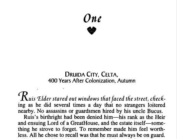
Robin D. Owens' Heart Thief has a lovely little glyph under the chapter heading, and the first line in italics. Threshhold, by Sara Douglass, featurs drop caps and a nice glyph above the chapter headings

Another thing to consider is how to treat the initial characters and/or line of text in a chapter or scene. Drop caps? First line in italics? First line in small caps? I’ve seen all of these done by big publishers, and it’s a nice way to set off the beginning of a chapter or scene. I didn’t care for the way drop caps looked in my book, and small caps wasn’t as uniform in appearance as I’d like, so I went with italics. Of course, there are other considerations like page size, margins, headers, and so on, but those are subjects for anotherblog (or several).

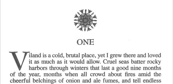
Threshhold, by Sara Douglass, featurs drop caps and a nice glyph above the chapter headings

Then there are glyphs. I loooooooove glyphs – those little, deccorative images that sometimes display with chapter headings, or between scenes. I didn’t think they’d be practical to do in eBooks, but then happened upon a wonderful book with awesome little glyphs between scenes, so I knew I had to have them in my book, too! What’s really cool is when the image directly relates to the story, as is the case in both of Cate Rowan’s books, as well as mine.

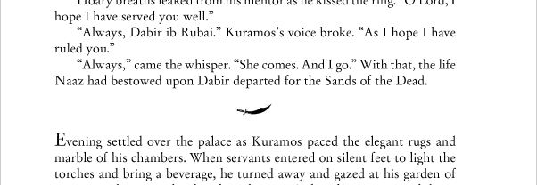
Kismet's Kiss glyph

The scimitar is an important prop in Cate Rowan's Kismet's Kiss


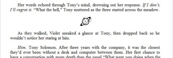
Saturn Society logo

A tiny Saturn Society logo separates the scenes in my books

If a book is typeset in an unusual font, or has glyphs separating scenes or with chapter headings, I notice. I figure this is due to my background in graphic design, but maybe not – do you notice little details like this? Got any examples to share of particularly attractive chapter headings, or scene separation glyphs?

Oh, and by the way, these are all awesome books! For some reason, I’m either into fantasy romance right now, or maybe those are just the kind of books that are more likely to feature these design details. Pretty pictures or not, Heart Thief, Threshhold, and Kismet’s Kiss are fantastic books. If this is your kind of story, I encourage you to check them out. And of course, I’d love for you to check out Time’s Enemy!

My Town Monday: The Little Things

One of the fun things about writing (and reading) time travel stories is the whole fish-out-of-water aspect, especially when someone goes into the future. There is one scene in Time’s Enemy, my newly-released time-travel novel, where a character from the 1930s comes forward to modern times. When she asks for a drink and is handed a can of Mountain Dew, she’s understandably perplexed at what to do with it (and initially thinks it’s moonshine, LOL).
Anyone remember drinking beer or pop (“soda” for you non-Midwesterners) from a can like this? Younger folks might not, but in the sixties, seventies, and into the early eighties, this is what you got if you bought beer in a can, or got a Coke, Pepsi, etc. from a machine. Of course, I also remember pop in glass bottles – you know, where you bought a six pack at Kroger and paid a deposit of $.05 – .10 per bottle, which they returned when you took the bottles back to the store.

But back to the cans – before they were like this, they required a can opener, like is still used today to open larger cans of juice, although those are now mostly replaced by bottles. The can opener had a sharp point on it, and poked a triangle hole in the edge of the can. A second hole was needed to admit air.

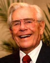
Dayton inventor Ermal Fraze

The pull tab shown on the can to the right came about in the early sixties, after Dayton tool-and-die maker Ermal Fraze went on a picnic, and forgot to bring a can opener for the drinks. According to the stories, he ended up prying cans open on a car bumper (???), then went home and devised a can with a built-in opener – the pull tab.

The pull tab was eventually superceded by the now-familiar push-in top in the eighties, but it was the pull tab that helped push cans to edge out glass bottles in popularity as a beverage container. Fraze’s legacy lives on today in the form of full-top pull tabs that are still commonly used in canned snacks like peanuts. Dayton Reliable Tool (now DRT Mfg.), the machine shop he formed in the 1940s, is also still in business in Dayton today.

Do you know of any cool little details that we take for granted today, that originated in your hometown? Please share!

More at the My Town Monday blog

Sources: http://en.wikipedia.org/wiki/Beverage_can
http://web.mit.edu/invent/iow/fraze.html
http://www.heartlandscience.org/manuf/poptop.htm

Photo of beer can via Wikipedia, public domain
Photo of Ermal Fraze via Heartlandscience.org

Time’s Enemy Now Available!

Time's Enemy CoverOne unwanted gift. One great wrong. One chance to make things right…

When a freak accident leaves Tony Solomon with the ability to travel in time, he becomes an unwilling initiate in the Saturn Society, a secret society of time travelers. Wanted by the Society for a crime he hasn’t yet committed, he seeks help from Charlotte Henderson, the woman whose life he saved decades before he was born. Loyal to the Society, Charlotte faces a terrible choice-condemn the man she loves and to whom she owes her life, or deny her deepest convictions by helping him escape and risk sharing his sentence.

Time’s Enemy is available for Kindle, Nook, and a variety of ebook formats on Smashwords and other retailers.  I’m also going to offer a discount coupon for Smashwords that will only be announced here, so check back soon, or better yet, subscribe!

Buy Time’s Enemy at Amazon | Barnes and Noble | Smashwords | All Romance eBooks

Print edition coming soon


book coverOn another note, Sheri McGathy’s short story “Promises” is now available in the Kindle Store as well! Many thanks to Sheri for letting me use her story as a guinea pig to learn Kindle formatting. If you enjoy epic fantasy and are looking for a quick read, give it a try! “Promises” is also available at Barnes & Noble and Smashwords, as well as iBookstore, Kobo, and other digital retailers.

My Town Monday: One of Dayton’s Happenin’ Places

The Dayton area has always been fortunate to have a fantastic library. For two centuries, the library has been a vital part of our community.

The very first officially-recognized public library in Ohio, Dayton’s first library was started in 1805, in the home of Benjamin Van Cleve. Back then, it was a pay service. The library moved several times and was even closed and all its books sold, on at least two occasion.

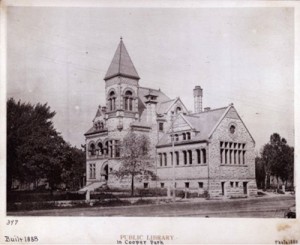
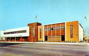
Photo of The old Dayton libraryThe precursor to today’s Dayton Metro Library was built on the current library’s property in 1888. This building was also home to a museum, which included natural history and Native American artifacts. The museum later became the Dayton Museum of Natural History, and eventually was renamed the Booneshoft Museum of Discovery. The museum was moved into its own location in 1955, and the library continued to serve as such until it was demolished, and the current building built, in 1961.

Today the libaray continues to be a happening place, with 20 branches located throughout Montgomery County. It’s unusual to drive past the two branches near me and not see the parking lots nearly full. In addition to traditional books and periodicals, the library began carrying music on tape in the seventies, which eventually expanded to VHS videos and audiobooks on tape, then Music CDs, DVDs, and audiobooks on CDs.  Dowloadable ebooks and audiobooks were added via Overdrive in the early 2000s – more on that in a future blog post. Programs for kids, teens and adults – on book-related subjects and otherwise – are popular.

Dayton Metro Library The library is once more outgrowing its downtown location, and has proposed an ambitious expansion plan in an effort to stay relevant and serve the community. Changes in technology – especially in book publishing – are creating a shift in how consumers patronize the library, and the usage of services has shifted to a lot more computer use, more online checkouts of e- and audiobooks, and more demand for meeting space, as opposed to shelf space for paper books. Studies have focused on cities like Fort Wayne, Indiana, where a new, expanded library has played a key role in revitalizing a stagnant downtown.
But the best part of the library remains the same – whatever book or written material you’re looking for, the library probably has it – and if they don’t, they have partnerships with a public libraries all over Ohio, and chances are, you’ll find it there. As has been the case for as long as I can remember, there’s no charge to have a book you’re looking for, transferred to your local branch if they don’t have a copy there. Loans for (and transfer of) materials from participating Ohio libraries are also free.

I got my first library card around age 6 or 7. Having lived in the area all my life, I’ve often taken the library for granted. But I’ve had friends who’ve moved out of the area to larger cities, who tell me their libraries don’t have near the selection Dayton’s library has.

What about you? Does your hometown have a great library? Do you use its service, or are you even aware of all your library offers?  (I admit that if I were to try to list them, I’d probably miss a few.)

Historic photo via Dayton Metro Library www.daytonmetrolibrary.org
1960’s photo – unknown

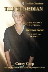
Do You Judge a Book by its Cover? The Guardian, by Carey Corp

The Guardian by Carey CorpA few weeks ago, writing friend Carey Corp emailed me, with the subject line “Help!”

No, her email hadn’t been hijacked by spammers. She was trying to produce the cover for the print version of her successful YA paranormal romance, The Guardian. She’d done a nice job putting together the cover for the e- version. And isn’t a cover for a print book simply a matter of adding a back and spine to the ebook cover?

Carey found out it wasn’t when she uploaded her print cover to CreateSpace, only to receive a message that it didn’t meet required specifications. After another try, and another reject, she emailed me.

Carey remembered that I worked in graphic design for over ten years before turning to web design, and later programming. And back when I was active in the field, print was still the thing. I was actually one of the first people in the Dayton area to use computer-prepared files for full-blown, four-color printing films, so all of the issues CreateSpace identified in their emails to Carey, were familiar to me.

The modifications I made were minor as far as appearance was concerned, such as adding another set of wings to the spine – I love little details like this! Reworking the rest with higher-resolution photos took a few hours in Photoshop, tweaking color density, printing to a PDF, then emailing to Carey. When I didn’t hear back within a few days, I figured no news was good news – and it was! See her take here.

I am not a big reader of Young Adult fiction, but going by the description, this is something I would have devoured when I was a teen. A lot of Carey’s readers are adults, too, and the more I read this description as I reworked the art, the more intrigued I became – I might just have to pick up a copy! The Halo Chronicles: The Guardian (Kindle version) THE HALO CHRONICLES: The Guardian (Volume 1) (Print version)

Do you enjoy YA fiction? And, do you pass on a book if the cover’s not quite professional? (I’ll admit it – it takes a lot more to get me to buy if the cover’s less than appealing.) If you’re an author, ever try doing your own cover? As a graphic design professional, I’m a big proponent of “don’t try this at home” but for some, it can work out well. What do you think?

My Town Monday: Guilty or Innocent, 115-year old case – could you decide?

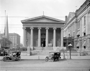
Dayton, Ohio is no stranger to murder – just watch the news, and it seems there’s one almost every day. But a hundred years ago, murder was a novelty, and a trial for such, a spectacle people came to see from miles away. Yesterday afternoon, Dayton History reenacted such a case in the original Old Courthouse, that still stands at Third and Main today, giving us a chance to see what it might have been like, and even participate in the trial, over a hundred years later.

Dayton's Old Courthouse in the early 20th century

Dayton's Old Courthouse in the early 20th century

Upon entering the courthouse, Dayton History staffers gave the audience a sheet of the text of actual newspaper articles printed at the time. They were printed on yellow photocopy paper, which was amusing considering some of the yellow journalism within. 🙂

In September of 1896, 20-year-old Albert Frantz was accused of murdering Bessie Little, the 23-year-old woman he’d been seeing, whose body was found in the Stillwater River. There were a lot of suspicious circumstances leading up to the verdict of whether Miss Little had committed suicide, as was initially thought, or if she died by another’s hand. Witnesses described how Bessie was caught “in a compromising position” with Mr. Frantz in her parents’ barn, which led to him putting her up in a hotel soon after (there were few living options for single women in those days). It also came to light that she’d seen a doctor, and had been declared pregnant, and Mr. Frantz supposedly wanted to marry her, but was unable due to being underage – and his parents refused to give consent.

At the hotel, they found a letter from Bessie, addressed to Mr. Frantz’s parents, begging them to let their son marry her. But the most telling evidence was found on a newly-constructed bridge, that crossed the Stillwater into what was then a lightly-populated part of town: blood on the bridge itself, and a track mark from it that looked like a buggy had been driven through it.

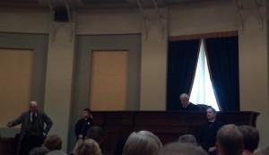
Reenactment of murder trial in Dayton

Last weekend's reenactment

Mr. Frantz had been planning to take his sweetheart for a ride the last evening she was seen alive.

Other evidence was produced throughout the trial, which in reality, reconvened throughout the next three months. One item was the woman’s skull! It had been kept in a jar of alcohol at the police office, after her body had been exhumed from her resting place in the potter’s field in Woodland Cemetery, when her manner of death was first called into question. When the skull was brought in, the “bailiff” opened the courtroom’s windows, due to the undoubtedly-horrendous smell! The reason the skull was unearthed was probably the biggest factor in the ultimate determination of the court: Miss Little had been shot in the head through the ear, twice.

The prosecution and defense both presented their closing statements – both waxing rather melodramatic at times – then the jury (which were picked from the audience) went to deliberate. As in a modern, Ohio court proceeding, the jury was instructed to issue a guilty verdict only if the prosecution was able to “remove all reasonable doubt.” I was guessing they’d say “Not Guilty,” because despite the evidence, the state hadn’t removed all doubt. When they issued their verdict, the jury agreed, and the “judge” told the defendant he was free to leave.

The Dayton History staffers handed us another sheet of newspaper articles on the way out, containing the results of the trial: Guilty of First Degree Murder! It turns out that, after a series of failed appeals, Mr. Frantz became the fourth person in Ohio to die by electric chair, almost a year later.

Can you imagine that quick of an appeals process now? Or presenting the actual corpse as evidence in a trial? (Thank goodness for modern photography and videography!) And interestingly enough, do you think the modern-day jury was more compassionate, more discerning of the evidence, or maybe just more hard of hearing? (There was a lot of echo in the courtroom, and yes, it was hard to hear sometimes.) Anything fun like this reenactment in your home town? Please share!

Note: This program will be presented three times next weekend, August 5, 6, and 7 –  Details at DaytonHistory.org.
Want to learn more about this case? Check out Spilt Blood, by Curt Dalton (one of the researchers for the reenactment)

More at the My Town Monday blog

Historic photo via Dayton History

Updated Books: Cool, or Fail?

I’m currently working on revising Time’s Fugitive, my second time travel romance, and sequel to my upcoming release, Time’s Enemy. Like Enemy, the first draft of this book was written a few years ago. What’s surprising is how many things in the world around us have changed since then – things that now need to be changed. For example, I have a scene where a character’s car breaks down, and the young driver and her passenger need to walk for help. Yes, they have cell phones – it wasn’t written that long ago – but what I now need to account for is the fact that many late-model cars (including the one they have) now come with some kind of navigation system, which also includes a way to call for help. This needs to be revised so that there’s a good reason they can’t just press the red button on the rearview mirror and get help from OnStar. Another book of mine features computer technology – including national security-sensitive software that goes missing. In the original book, written over ten years ago, the software was on a removable disk cartridge, like a Zip Disk. (Anyone remember those?) In a recent revision, this needed to be changed to be on a USB flash drive.

This reminded me of Stephen King’s The Stand – which I first read in the late 90’s, after it had been updated from the original version published in 1976. Definitely a book I enjoyed, despite a few details where not enough attention was given to updating. In the original version, characters drove across a post-apocalyptic U.S., preferably in the largest vehicles practical – in most cases, station wagons.

In the 90’s version, these characters were still taking station wagons.

Huh? In the 90’s I remember, there were a heck of a lot more minivans and SUVs than station wagons. Not to mention, a 4WD SUV would be much more practical than a station wagon, especially for driving off road. And cell phones? I don’t remember if they were mentioned – they might’ve been, and there was no power, hence no operable cell networks. But the characters used CB radios to communicate – which hit their heyday in the mid-70’s.

So think about those updates when you’re revising an old novel – I still enjoyed The Stand, but little details like this did take me out of the story, and remind me I was reading. So if the contemporary American heroine in the book you’re reading is in trouble and she’s not using her cell phone, you might flip to the copyright page, and see if you’re reading an old book. Otherwise, there’d better be a good reason that heroine can’t just call for help, or you might have an Update Fail on your hands.

Does it bother you to read books where the details are outdated? I’m willing to forgive it if it’s an old book, but otherwise, it might just be sloppy writing. What do you think?

Time Management: How’s That Working Out for You?

A couple weeks ago, we discussed how we want to use our time… and how we actually do use that time. For those of us who work a full-time job, have a family, and have a writing “job” on the side, it can be especially challenging.

So how’s it going two weeks in? For me, it’s gone quite well… at least during the week. I’ve managed to get an hour of time working on my current book in revision each weeknight, just as I’d planned. In addition, I also got a workout in every night, something I haven’t done regularly for some time, so that’s significant.

The above is not to say my schedule never got disrupted, but that’s OK because I outlined it to allow for that.

For example: On Tuesday night, DH suggested going out to dinner. The Schedule allows for an hour for dinner, which includes spending time with and feeding the critters. It also allows an hour for chores. However, going out to dinner took two hours, as we met friends and had a couple beers too. So that night, something had to be sacrificed from the schedule: chore time. (Hint: any time something disrupts the schedule and something’s gotta go, chores wins, hands-down, unless there’s something there that can’t be put off, i.e. paperwork/bill paying when the bills are due within a few days.) On another day, I ended up doing unplanned mom-taxiing (and I think that was a day the paperwork couldn’t be put off), so writing business got left off. No problem there – I have it on the schedule every night, but honestly, there isn’t business stuff that needs to be done every night.

Where time management might continue to be a challenge is on the weekend. When we have Two Whole Days stretched out before us, it’s easy to put off whatever’s on the To-Do list, until next thing we know, it’s 10:30 PM Sunday night, and we haven’t written Monday’s blog yet <cough>. We also have the tendency to see that big block of time and fill it too full, without leaving any time for what the weekend’s supposed to be for: going somewhere, doing fun things with family and friends, or just relaxing – which are all sooo important, to avoid burnout.

So that’s my next challenge – get caught up on the stuff I didn’t get done this weekend, and figure out how to manage that time, so I don’t run into this next weekend.

Especially since I have some family fun planned.

What about you? Have you seen a difference since taking a harder look at how you spend your time? Any suggestions or insights to share?

Illustration via Microsoft Office Images