A Binge that Won’t Hurt Your Waistline – or Your Wallet

The Buffet opens today – the Booklovers’ Buffet, that is!

Nearly 100 authors of  Romance, Science Fiction and Fantasy, Historical Romance, Inspirational, Mystery, Suspense, Thrillers, Women’s Fiction, Young Adult fiction, and non-fiction team up to offer the Booklovers’ Buffet, the buffet where you can load up without gaining a pound! Even better, every ebook on the buffet is only $.99, so you can load up without hurting your wallet, either. A great way to find new (or new-to-you) authors! So stop by BookloversBuffet.com today and stock up!

If you’ve been thinking about giving Time’s Enemy a read, here’s your chance to do it on the cheap! Or, if you’re in the Dayton area, you can now check out the print version from Dayton Metro Library!

  • The sale price is for e-books – many are also available in print, at higher prices.
  • Most books are offered through Amazon, Barnes & Noble, and Smashwords, so readers have a choice of retailers and formats.
  • The Buffet includes full-length novels, novellas, and short stories – most are novels.

This is a limited-time offer, so don’t wait too long!

Good Stories: “The Spelling Error” by Athena Grayson

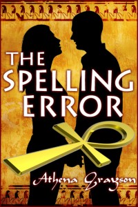
I just finished re-reading another good short story: “The Spelling Error,” by Athena Grayson. Athena is a writer friend of mine, and “The Spelling Error” appeared in an anthology, Words of the Witches, several years ago.  It was as good last night as it was then!

What I really liked about “The Spelling Error” was how it breaks a stereotype held by many of us regarding people of pagan faiths. Many of us who grew up in conservative Christian homes probably have heard that pagans were “evil,” or at least, woo-woo new-agey types. While there may be some truth the later, the first couldn’t be further from it.

Lucy Dane is the 12-year-old daughter of a single dad – who also happens to practice pagan worship and the occasional bit of magick. So when her best friend blackmails her into casting a love spell for her, Lucy complies, even though her dad has warned her of the dangers of inexperience and magick, and forbidden its use until she’s older. For herself, Lucy wishes for someone to love her just the way she is.

Her dad, Paul, already does, which is why he’s determined to make his small coffee shop a success – or else Lucy will be sent to live with her grandparents. But things aren’t going so well, until business consultant Mira Taggart shows up to help Paul get his business on the right track. Things quickly heat up between them, and it’s up to Lucy to figure out if it’s the spell she miscast… or something more.

Rather than being the stereotypical expectation, Paul, Lucy, and Mira are well-drawn people so realistic it wouldn’t be a surprise to run into them at the grocery store, kids’ sports, or – of course! – at a coffee shop. Their values are the same as those practiced by those of more “mainstream” American faiths: family first, do no harm, and leave things as you found them – or better. Lucy’s point of view is exactly what we’d expect from an almost-thirteen-year-old who only wants to do what’s best for her friend and family, even if it means going behind Dad’s back.

As a side note, I designed the cover for Athena – a fun project, with the Egyptian influence! (Paul’s particular brand of paganism stems from ancient Egyptian deities and faith.)

If you’re looking for an entertaining and engaging way to spend a half hour or so, check out The Spelling Error! It’s available in e-book form from Amazon, Barnes and Noble, and Smashwords.

Read any good short stories lately? Let me know in the comments!

Where do Print Books Come From?

Books and e-readerIt seems ebooks are getting all the press (virtual and otherwise!) lately. Ebooks and e-readers are all the rage – instant gratification! Large type, if you want! More choices! Tons of cheap and even free books! No restrictions on length, whether you’re reading a four-page flash fiction piece, or a tome to rival War and Peace. No e-reader? Read ’em on your phone or even your computer! What’s not to like?

Yet despite all the advantages ebooks offer, plenty of people still prefer to read a good old fashioned paper book. The smell and feel of the paper! Pretty book covers that look cool on your bookshelf or coffee table! Read ’em in the bathtub – and if you drop it, no expensive electronics to replace! Heck, no expensive electronics to buy in the first place! Browse in the bookstore or the library! Used books! No worries about dead batteries! Despite all the gloom-and-doom reports of ever-decreasing sales, paper books are still with us, and aren’t going away any time soon IMO.

Quite a few independent publishers are forgoing print altogether and publishing only in e. After all, print typically involves a setup fee, and print also requires some knowledge of print graphic arts, which is a whole different animal than on-screen graphics. It’s definitely a lot more work to produce a print book, even though the setup fees have gone way down in recent years, and there’s no longer a need to warehouse and ship – Amazon, Barnes & Noble.com, and the like are still happy to fulfill that role for a piece of the action.

Time's Enemy print book

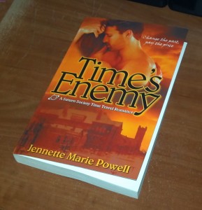
Time's Enemy in print - available soon!

Out of all the people I’ve talked to who’ve expressed interest in reading Time’s Enemy, about half of them next ask, “Is it available in print?” So as someone with graphic arts experience, I really have no reason not to offer this, and to that end, I uploaded my book to a printer last Saturday. My proof arrived on Wednesday, I approved it on Thursday, and it should be available on the e-retailers in the next week or so. When that time comes, I’ll announce it here!

So where do print books come from? If you’re an independent publisher, they most likely come from one of two printers: CreateSpace (which is owned by Amazon), or Lightning Source (which is owned by Ingram, the largest print book distributor in the U.S.). CreateSpace (henceforth referred to as CS) is definitely the easier of the two as far as setting up the files for printing, and they have a lower setup fee as well. But Lightning Source (LSI) has some major advantages in other areas, and after some major deliberation, I went with LSI.

Most of these differences won’t be apparent to the reader. One of them is how authors are paid – basically, CS requires a larger portion of the book’s price go to the retailer, meaning the author and publisher make less money, while the reader’s cost doesn’t go down (usually – sometimes the retailers will discount). Books produced by LSI are automatically included in Ingram’s catalog, which may make it easier for them to be ordered by bookstores and libraries.

The most apparent difference – at least with my book – is that LSI offers a matte cover, whereas other print-on-demand providers offer only glossy covers. Until LSI offered it earlier this year, only big publishers’ books had matte covers. A lot of readers probably don’t care, but it gives a book a “richer,” higher quality look and feel IMO.

So what about you – do you notice things like glossy or matte covers? Does the “feel” of a book matter to you? Print-on-demand books are typically printed on heavier paper, which obviously makes the book heavier, but also adds to that “richer” feel. Is this something you notice or care about? Inquiring independent authors and publishers want to know!

Cover Art for Time’s Fugitive

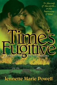
Time's Fugitive book coverI design my own book covers (sometimes my graphic design background comes in handy), and was pleased to finish this one last week. Time’s Fugitive is the sequel to Time’s Enemy, and is slated for release as an e-book in December. Depending on how print book sales go for Time’s Enemy, Time’s Fugitive will also be released in print, about a month after the digital release.

Covers matter a lot to me, never mind the old saying “Don’t judge a book by its cover.” People do. I know I do. Authors published by big publishing houses usually have little to no input in cover art. There are a lot of bad covers. By “bad,” I mean poorly executed, unreadable, or just plain ugly. They happen to independently-published books and to those from small publishers, but they happen to big-time published books, too – the three-armed woman on Christina Dodd’s Castles in the Air is probably the most classic example. Then there were the notorious, ugly “nekkid Poser people” that seemed to appear on every other erotic ebook for a while. I’m glad that trend went away! Designing my own covers means I don’t have to worry about any of that. If a cover misses the mark, I can easily upload a new one, with the only cost being my time and any stock photos I have to license.

Something Dangerous by Patrick Redmond

I totally grabbed this book because of the cover!


Even if you’re paying someone, there are some great cover artists who provide wonderful covers for very reasonable fees – I’ve seen as little as $100. I’m not looking for cover art work right now, but if you’re an independent author and you’re looking for cover art, I recommend my cousin and fellow author, Sheri McGathy. Sheri also does copy editing (including mine).

The Writers’ Guide to Epublishing did a good article about cover art a couple weeks ago, and the commenters (mostly or all authors) pretty unanimously agreed that good covers sell books, and bad covers can hinder sales. What do you think? Whether you’re an author or a reader, do you care about cover art? Has a cover ever made you pick up a book (and buy), or conversely, has a book cover ever made you not buy a book you otherwise might have?

Guest Blog: Jim Winter

First of all, thanks to Jim for joining us here, and helping to make the mundane magical! I’ve known Jim for a loooooong time – we met my freshman year in college, <cough> years ago, through a mutual friend. I served as an early sounding board for some of Jim’s early Star Trek fanfic (you knew I’d mention that, didn’t you?:)) and later, as a beta reader for his first efforts at publishing crime fiction. Jim returned the favor and gave me some good advice for Time’s Enemy, and assured me that, yes, Tony indeed thought and acted like a guy.

So let’s dig a little deeper, and take a look at what makes Jim – and his characters – tick:

Jim, you’ve been published before by a small press. Your novel, Northcoast Shakedown, was a crime fic piece that I really enjoyed, even though that’s not a genre I read a lot. Please share your publishing experience with us:

Well, when I signed, the publisher was full of energy, and everyone on the roster became everyone else’s cheerleader. There were some hiccups getting Northcoast out, but it was a fun ride. And at the time, I had some money to spend on travel, so I used that to beef up my networking and get to know authors and booksellers. That first year was fun.

The second year was not so fun, but when any business goes under, there’s no clean way to sever ties. It’s too bad, because I really thought they could do something or be a decent launchpad for a lot of the writers. I think that’s true of a lot of small presses when they overreach. I remember UglyTown did not go quietly, despite both the publishers’ and authors’ best efforts, and Point Blank just sort of faded away. But for a short time in the middle of the last decade, it was a wild ride.

There are two more books featuring Nick Kepler, the protagonist of NCS, both of which I also beta-read and really enjoyed. I remember reading Bad Religion at work during a slow period, and having to restrain myself from laughing out loud. IMO, these books deserve to see publication, and NCS deserves another chance. Now that you’ve gone indie, do you have any plans to (re)release them?

Northcoast will definitely be out later this year. Noir master Ken Bruen wrote me a very nice intro, and I found out it was sitting on a shelf he uses for quotes when he writes. So I was very touched by Ken’s intro. He’s been one of my mentors for years, and I have one project under wraps that will bear his name on the dedication page. I’m not saying which one.

The second book, aptly titled Second Hand Goods, is going to get a rewrite and a fresh edit. I’ve evolved as a writer, and since its collected cyberdust for the last five years, I can look at it a bit more objectively.

Bad Religion is just screaming for some fresh material based on my experiences since the early drafts. I’ll likely downplay Nick and Elaine somewhat to focus on some of the other characters.
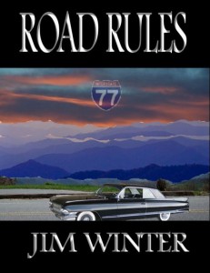
Road Rules coverWhich brings me to your new release, Road Rules. This book has a history of its own, including snagging an agent’s interest. Can you share a bit of that with us?

The seeds of Road Rules have been around for some time. Tim Mason was the earliest. A mutual acquaintance of yours and mine introduced me to this weird coworker. I’d toyed with making him a lawyer in a standalone (picturing Seth Green in the part) and a thorn in Kepler’s side, a role eventually taken by the Eric Teasdale character.

A couple years later, my publisher and I kicked around the road trip idea. I wrote a short sketch about two guys in a stolen Cadillac trying to get to Miami. Tim Mason sort of attached himself to the story.

After I got orphaned, a few friends prodded me into doing NaNoWriMo in 2006. So I fleshed out the story, hit on the idea of the decadent, yet spiritual drug lord, Julian Franco as the cause of all this chaos, and boom! The story demanded to be written.

Road trip stories are always fun! I love your tagline, “The road to hell begins with a stolen car.” But what really pulled me in were the characters. Were there any particular events, places, things you saw/heard/read that inspired the overall premise of the book, its events, or any of the characters?

The route they took was once the “long way home” from Hilton Head, SC, over a few years last decade. And having visited Savannah a few times in the process left me longing to write something set in that city. I still wanted to write about Cleveland, where I-77 begins, so the setting fell together easily.

I saw a few shows on History about holy relics and one of those true crime things about the theft of one such relic. Put those together in a city with a large Slavic population and you get St. Jakob.

Mike is based on years of working in the insurance industry. Maybe too many years. And Cinnamon was part of my desire not to have a bunch of macho white guys hosing the freeway down with testosterone. Plus, instead of the angsty tarnished knight, she’s someone just trying to prove herself.
Back in May, you released your first indie title, a short story called “A Walk in the Rain” (also a good read). What made you decide to go indie?

Well, crime doesn’t really pay well. Of course, I’ve got a short story in West Coast Crime Wave coming out this month from Bstsllr.com, which I did get paid for, but the paying markets are few and far between. I decided to get paid for my short work. I also found out that 1.) It’s the cover, stupid (though content still rules), 2.) people don’t really buy a lot of short fiction on Amazon unless it’s a collection, and 3.) it might help if you actually market an ebook.

(Jennette: A Walk in the Rain is available at Amazon for $0.99.)

Now that you’ve tasted the control and flexibility that comes with indie publishing, are you still pursuing a traditional publishing contract, or perhaps another agent?

I think eventually, I’d like to go traditional, but only under certain circumstances. I’m in a position now where I don’t have to make this a career. So the terms have to be right, and I have to be able to keep control of material I’ve already published. But if the right deal can be worked out, sure, I’ll sign.

Are you planning to offer Road Rules in print?

If enough copies sell, I’ll put it on CreateSpace. If a publisher makes a sweet enough offer, I’ll seriously consider it.

Now that Road Rules is out, what’s next for Jim Winter?

Northcoast, as I said, will be coming out. And the other two Keplers will see revisions and fresh edits. Then there’s my “magnum opus,” which I’ve been reworking since the original draft checked in at 105,000 words.


Thanks again for being here, Jim! And to everyone else, Road Rules is a fantastic, fun read that you owe it to yourself to check out, even if you don’t normally read crime fiction. It’s a fast-paced caper that will keep you reading – and laughing – all the way from Ohio to Georgia, along with Mike, Stan, and Cinnamon. Road Rules is available in your choice of e-formats for a knockout price of $ .99 at Amazon, Barnes & Noble, and Smashwords.

Jim keeps a fun, entertaining blog at http://eviljwinter.wordpress.com where he writes about books, publishing, sports, Cincinnati, technology, and whatever else strikes his fancy.

Anyone have questions for Jim? Feel free to ask, or just comment to say Hi!

Little Details in Books: Do You Notice Them?

I’m not talking about story details; I’m talking about little, visual details – graphics, chapter headings, fonts.

I’ve been thinking about these details a lot because now that Time’s Enemy is out in digital format, I’m starting to work on the print version.

There are a lot of extra considerations to make when planning a print version. There’s a lot more to creating a print cover, but there are also many decisions for the book’s interior. Foremost is which font to use for the body text? And yes, there is life after Times New Roman. I considered Garamond, Palatino, and Book Antiqua, but finally settled on Caxton. It’s a really pretty font, is sort of a combination of old style with a modern flair, and gives the page a nice, even “color.” The main thing you’re looking for is readability, and for body text that’s going to be printed, that usually means a serif typeface. For those unfamiliar with graphic arts terms, “serif” means the typeface has little brackets on the ends of the letter strokes. All the fonts I’ve mentioned above are serif typefaces. Sans-serif fonts (i.e., fonts without serifs) include Arial, Verdana, and Trebuchet, and are better suited for headings or on-screen reading, such as web pages.

The print version of Time's Enemy is set in Caxton, with right-justified chapter headings

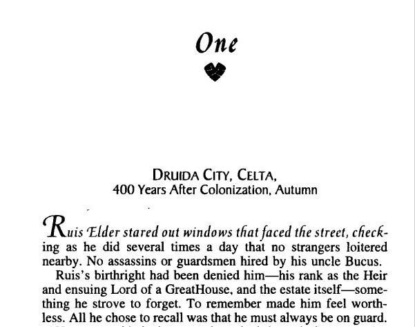
The next consideration is display type, or what font to use in chapter headings and on the book’s title page. This is a good place for decorative fonts, and book designers can have a lot of fun with these. For my print book, I’m leaning toward Belwe, which is the same display font as the title on the book cover. Chapter headings are typically centered, but not always, and I liked the way my chapter headings look right-aligned, with a thin border beneath. Some books spell out “Chapter One,” while others just say “One” or even just have the numeral: 1. And finally, some feature small graphics, or glyphs, beside, above or below the chapter heading.

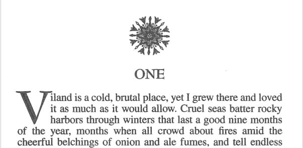
Robin D. Owens' Heart Thief has a lovely little glyph under the chapter heading, and the first line in italics. Threshhold, by Sara Douglass, featurs drop caps and a nice glyph above the chapter headings

Another thing to consider is how to treat the initial characters and/or line of text in a chapter or scene. Drop caps? First line in italics? First line in small caps? I’ve seen all of these done by big publishers, and it’s a nice way to set off the beginning of a chapter or scene. I didn’t care for the way drop caps looked in my book, and small caps wasn’t as uniform in appearance as I’d like, so I went with italics. Of course, there are other considerations like page size, margins, headers, and so on, but those are subjects for anotherblog (or several).

Threshhold, by Sara Douglass, featurs drop caps and a nice glyph above the chapter headings

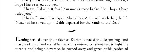
Then there are glyphs. I loooooooove glyphs – those little, deccorative images that sometimes display with chapter headings, or between scenes. I didn’t think they’d be practical to do in eBooks, but then happened upon a wonderful book with awesome little glyphs between scenes, so I knew I had to have them in my book, too! What’s really cool is when the image directly relates to the story, as is the case in both of Cate Rowan’s books, as well as mine.

Kismet's Kiss glyph

The scimitar is an important prop in Cate Rowan's Kismet's Kiss


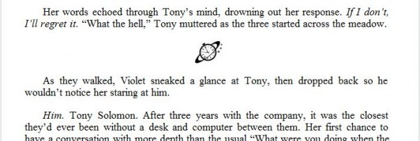
Saturn Society logo

A tiny Saturn Society logo separates the scenes in my books

If a book is typeset in an unusual font, or has glyphs separating scenes or with chapter headings, I notice. I figure this is due to my background in graphic design, but maybe not – do you notice little details like this? Got any examples to share of particularly attractive chapter headings, or scene separation glyphs?

Oh, and by the way, these are all awesome books! For some reason, I’m either into fantasy romance right now, or maybe those are just the kind of books that are more likely to feature these design details. Pretty pictures or not, Heart Thief, Threshhold, and Kismet’s Kiss are fantastic books. If this is your kind of story, I encourage you to check them out. And of course, I’d love for you to check out Time’s Enemy!

Time’s Enemy Now Available!

Time's Enemy CoverOne unwanted gift. One great wrong. One chance to make things right…

When a freak accident leaves Tony Solomon with the ability to travel in time, he becomes an unwilling initiate in the Saturn Society, a secret society of time travelers. Wanted by the Society for a crime he hasn’t yet committed, he seeks help from Charlotte Henderson, the woman whose life he saved decades before he was born. Loyal to the Society, Charlotte faces a terrible choice-condemn the man she loves and to whom she owes her life, or deny her deepest convictions by helping him escape and risk sharing his sentence.

Time’s Enemy is available for Kindle, Nook, and a variety of ebook formats on Smashwords and other retailers.  I’m also going to offer a discount coupon for Smashwords that will only be announced here, so check back soon, or better yet, subscribe!

Buy Time’s Enemy at Amazon | Barnes and Noble | Smashwords | All Romance eBooks

Print edition coming soon


book coverOn another note, Sheri McGathy’s short story “Promises” is now available in the Kindle Store as well! Many thanks to Sheri for letting me use her story as a guinea pig to learn Kindle formatting. If you enjoy epic fantasy and are looking for a quick read, give it a try! “Promises” is also available at Barnes & Noble and Smashwords, as well as iBookstore, Kobo, and other digital retailers.

My Town Monday: One of Dayton’s Happenin’ Places

The Dayton area has always been fortunate to have a fantastic library. For two centuries, the library has been a vital part of our community.

The very first officially-recognized public library in Ohio, Dayton’s first library was started in 1805, in the home of Benjamin Van Cleve. Back then, it was a pay service. The library moved several times and was even closed and all its books sold, on at least two occasion.

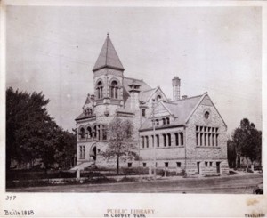
Photo of The old Dayton libraryThe precursor to today’s Dayton Metro Library was built on the current library’s property in 1888. This building was also home to a museum, which included natural history and Native American artifacts. The museum later became the Dayton Museum of Natural History, and eventually was renamed the Booneshoft Museum of Discovery. The museum was moved into its own location in 1955, and the library continued to serve as such until it was demolished, and the current building built, in 1961.

Today the libaray continues to be a happening place, with 20 branches located throughout Montgomery County. It’s unusual to drive past the two branches near me and not see the parking lots nearly full. In addition to traditional books and periodicals, the library began carrying music on tape in the seventies, which eventually expanded to VHS videos and audiobooks on tape, then Music CDs, DVDs, and audiobooks on CDs.  Dowloadable ebooks and audiobooks were added via Overdrive in the early 2000s – more on that in a future blog post. Programs for kids, teens and adults – on book-related subjects and otherwise – are popular.

Dayton Metro Library The library is once more outgrowing its downtown location, and has proposed an ambitious expansion plan in an effort to stay relevant and serve the community. Changes in technology – especially in book publishing – are creating a shift in how consumers patronize the library, and the usage of services has shifted to a lot more computer use, more online checkouts of e- and audiobooks, and more demand for meeting space, as opposed to shelf space for paper books. Studies have focused on cities like Fort Wayne, Indiana, where a new, expanded library has played a key role in revitalizing a stagnant downtown.
But the best part of the library remains the same – whatever book or written material you’re looking for, the library probably has it – and if they don’t, they have partnerships with a public libraries all over Ohio, and chances are, you’ll find it there. As has been the case for as long as I can remember, there’s no charge to have a book you’re looking for, transferred to your local branch if they don’t have a copy there. Loans for (and transfer of) materials from participating Ohio libraries are also free.

I got my first library card around age 6 or 7. Having lived in the area all my life, I’ve often taken the library for granted. But I’ve had friends who’ve moved out of the area to larger cities, who tell me their libraries don’t have near the selection Dayton’s library has.

What about you? Does your hometown have a great library? Do you use its service, or are you even aware of all your library offers?  (I admit that if I were to try to list them, I’d probably miss a few.)

Historic photo via Dayton Metro Library www.daytonmetrolibrary.org
1960’s photo – unknown

Do You Judge a Book by its Cover? The Guardian, by Carey Corp

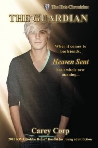
The Guardian by Carey CorpA few weeks ago, writing friend Carey Corp emailed me, with the subject line “Help!”

No, her email hadn’t been hijacked by spammers. She was trying to produce the cover for the print version of her successful YA paranormal romance, The Guardian. She’d done a nice job putting together the cover for the e- version. And isn’t a cover for a print book simply a matter of adding a back and spine to the ebook cover?

Carey found out it wasn’t when she uploaded her print cover to CreateSpace, only to receive a message that it didn’t meet required specifications. After another try, and another reject, she emailed me.

Carey remembered that I worked in graphic design for over ten years before turning to web design, and later programming. And back when I was active in the field, print was still the thing. I was actually one of the first people in the Dayton area to use computer-prepared files for full-blown, four-color printing films, so all of the issues CreateSpace identified in their emails to Carey, were familiar to me.

The modifications I made were minor as far as appearance was concerned, such as adding another set of wings to the spine – I love little details like this! Reworking the rest with higher-resolution photos took a few hours in Photoshop, tweaking color density, printing to a PDF, then emailing to Carey. When I didn’t hear back within a few days, I figured no news was good news – and it was! See her take here.

I am not a big reader of Young Adult fiction, but going by the description, this is something I would have devoured when I was a teen. A lot of Carey’s readers are adults, too, and the more I read this description as I reworked the art, the more intrigued I became – I might just have to pick up a copy! The Halo Chronicles: The Guardian (Kindle version) THE HALO CHRONICLES: The Guardian (Volume 1) (Print version)

Do you enjoy YA fiction? And, do you pass on a book if the cover’s not quite professional? (I’ll admit it – it takes a lot more to get me to buy if the cover’s less than appealing.) If you’re an author, ever try doing your own cover? As a graphic design professional, I’m a big proponent of “don’t try this at home” but for some, it can work out well. What do you think?

Updated Books: Cool, or Fail?

I’m currently working on revising Time’s Fugitive, my second time travel romance, and sequel to my upcoming release, Time’s Enemy. Like Enemy, the first draft of this book was written a few years ago. What’s surprising is how many things in the world around us have changed since then – things that now need to be changed. For example, I have a scene where a character’s car breaks down, and the young driver and her passenger need to walk for help. Yes, they have cell phones – it wasn’t written that long ago – but what I now need to account for is the fact that many late-model cars (including the one they have) now come with some kind of navigation system, which also includes a way to call for help. This needs to be revised so that there’s a good reason they can’t just press the red button on the rearview mirror and get help from OnStar. Another book of mine features computer technology – including national security-sensitive software that goes missing. In the original book, written over ten years ago, the software was on a removable disk cartridge, like a Zip Disk. (Anyone remember those?) In a recent revision, this needed to be changed to be on a USB flash drive.

This reminded me of Stephen King’s The Stand – which I first read in the late 90’s, after it had been updated from the original version published in 1976. Definitely a book I enjoyed, despite a few details where not enough attention was given to updating. In the original version, characters drove across a post-apocalyptic U.S., preferably in the largest vehicles practical – in most cases, station wagons.

In the 90’s version, these characters were still taking station wagons.

Huh? In the 90’s I remember, there were a heck of a lot more minivans and SUVs than station wagons. Not to mention, a 4WD SUV would be much more practical than a station wagon, especially for driving off road. And cell phones? I don’t remember if they were mentioned – they might’ve been, and there was no power, hence no operable cell networks. But the characters used CB radios to communicate – which hit their heyday in the mid-70’s.

So think about those updates when you’re revising an old novel – I still enjoyed The Stand, but little details like this did take me out of the story, and remind me I was reading. So if the contemporary American heroine in the book you’re reading is in trouble and she’s not using her cell phone, you might flip to the copyright page, and see if you’re reading an old book. Otherwise, there’d better be a good reason that heroine can’t just call for help, or you might have an Update Fail on your hands.

Does it bother you to read books where the details are outdated? I’m willing to forgive it if it’s an old book, but otherwise, it might just be sloppy writing. What do you think?