I’m not talking about story details; I’m talking about little, visual details – graphics, chapter headings, fonts.
I’ve been thinking about these details a lot because now that Time’s Enemy is out in digital format, I’m starting to work on the print version.
There are a lot of extra considerations to make when planning a print version. There’s a lot more to creating a print cover, but there are also many decisions for the book’s interior. Foremost is which font to use for the body text? And yes, there is life after Times New Roman. I considered Garamond, Palatino, and Book Antiqua, but finally settled on Caxton. It’s a really pretty font, is sort of a combination of old style with a modern flair, and gives the page a nice, even “color.” The main thing you’re looking for is readability, and for body text that’s going to be printed, that usually means a serif typeface. For those unfamiliar with graphic arts terms, “serif” means the typeface has little brackets on the ends of the letter strokes. All the fonts I’ve mentioned above are serif typefaces. Sans-serif fonts (i.e., fonts without serifs) include Arial, Verdana, and Trebuchet, and are better suited for headings or on-screen reading, such as web pages.

The print version of Time's Enemy is set in Caxton, with right-justified chapter headings
The next consideration is display type, or what font to use in chapter headings and on the book’s title page. This is a good place for decorative fonts, and book designers can have a lot of fun with these. For my print book, I’m leaning toward Belwe, which is the same display font as the title on the book cover. Chapter headings are typically centered, but not always, and I liked the way my chapter headings look right-aligned, with a thin border beneath. Some books spell out “Chapter One,” while others just say “One” or even just have the numeral: 1. And finally, some feature small graphics, or glyphs, beside, above or below the chapter heading.

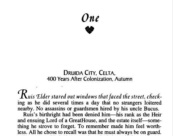
Robin D. Owens' Heart Thief has a lovely little glyph under the chapter heading, and the first line in italics. Threshhold, by Sara Douglass, featurs drop caps and a nice glyph above the chapter headings
Another thing to consider is how to treat the initial characters and/or line of text in a chapter or scene. Drop caps? First line in italics? First line in small caps? I’ve seen all of these done by big publishers, and it’s a nice way to set off the beginning of a chapter or scene. I didn’t care for the way drop caps looked in my book, and small caps wasn’t as uniform in appearance as I’d like, so I went with italics. Of course, there are other considerations like page size, margins, headers, and so on, but those are subjects for anotherblog (or several).

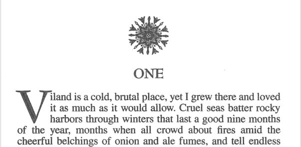
Threshhold, by Sara Douglass, featurs drop caps and a nice glyph above the chapter headings
Then there are glyphs. I loooooooove glyphs – those little, deccorative images that sometimes display with chapter headings, or between scenes. I didn’t think they’d be practical to do in eBooks, but then happened upon a wonderful book with awesome little glyphs between scenes, so I knew I had to have them in my book, too! What’s really cool is when the image directly relates to the story, as is the case in both of Cate Rowan’s books, as well as mine.

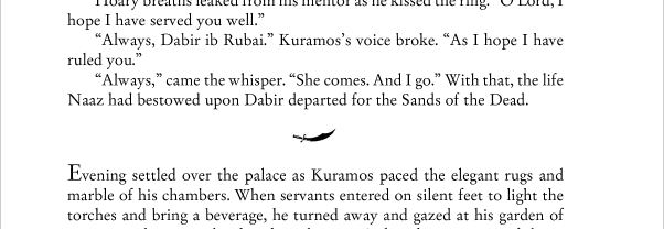
The scimitar is an important prop in Cate Rowan's Kismet's Kiss

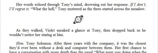
A tiny Saturn Society logo separates the scenes in my books
If a book is typeset in an unusual font, or has glyphs separating scenes or with chapter headings, I notice. I figure this is due to my background in graphic design, but maybe not – do you notice little details like this? Got any examples to share of particularly attractive chapter headings, or scene separation glyphs?
Oh, and by the way, these are all awesome books! For some reason, I’m either into fantasy romance right now, or maybe those are just the kind of books that are more likely to feature these design details. Pretty pictures or not, Heart Thief, Threshhold, and Kismet’s Kiss are fantastic books. If this is your kind of story, I encourage you to check them out. And of course, I’d love for you to check out Time’s Enemy!


