#ROW80: Week 1 Wednesday Update

I usually don’t get a lot of writing done on Mondays or Tuesdays, because Monday is paperwork night, and both nights are big TV nights for DH. Yet, I managed to knock out my first goal of the week: I finally noted the remaining places in my manuscript where plot holes need to be plugged – yay! There were quite a few, so that’s one revision step that took longer than the week I’d originally planned for it.

That leaves timing and sequencing for the rest of the week for me. If anyone else here has done Holly Lisle’s How to Revise Your Novel workshop, this is Lesson 14 and 15. This is my third book using this system, so I’ve managed to compress it a bit. Anyone else using HTRYN?

Good luck to my #ROW80 peeps!

#ROW80 Goals

I am taking part in a new writing challenge – well, new to me at least. It’s called Round of Words in 80 Days, and the idea is to set a measurable goal not only for the challenge as a whole, but each week. We report our progress each Sunday and Wednesday, so I’ll be doing that here. If nothing else, it will keep me accountable on my revisions for Time’s Fugitive.

So here goes:

My goals for the 80 days are:

  1. Finish revisions on Time’s Fugitive by November 7, with the ultimate objective of a release by Christmas (although that depends on my beta readers and editors too). I have specific steps to achieve this, so it’s not just a big eat-the-elephant goal.
  2. While Time’s Fugitive is with the beta readers and editor, my goal is to either outline the second half of the book I started for NaNoWriMo 2009 and never finished, or to outline a new Saturn Society novella – I’ll figure out which when the time comes.

This week’s goals are:

  1. Mark where changes are needed in Time’s Fugitive to fix plot holes
  2. Review scene sequence and timing issues, note fixes where needed. This sounds simple, but it’s time travel – with multiple characters traveling in multiple times – so it’s not. Especially since I want it to make sense to readers. 🙂 After all, that’s all of us writers’ ultimate goal, right?

Where do Print Books Come From?

Books and e-readerIt seems ebooks are getting all the press (virtual and otherwise!) lately. Ebooks and e-readers are all the rage – instant gratification! Large type, if you want! More choices! Tons of cheap and even free books! No restrictions on length, whether you’re reading a four-page flash fiction piece, or a tome to rival War and Peace. No e-reader? Read ’em on your phone or even your computer! What’s not to like?

Yet despite all the advantages ebooks offer, plenty of people still prefer to read a good old fashioned paper book. The smell and feel of the paper! Pretty book covers that look cool on your bookshelf or coffee table! Read ’em in the bathtub – and if you drop it, no expensive electronics to replace! Heck, no expensive electronics to buy in the first place! Browse in the bookstore or the library! Used books! No worries about dead batteries! Despite all the gloom-and-doom reports of ever-decreasing sales, paper books are still with us, and aren’t going away any time soon IMO.

Quite a few independent publishers are forgoing print altogether and publishing only in e. After all, print typically involves a setup fee, and print also requires some knowledge of print graphic arts, which is a whole different animal than on-screen graphics. It’s definitely a lot more work to produce a print book, even though the setup fees have gone way down in recent years, and there’s no longer a need to warehouse and ship – Amazon, Barnes & Noble.com, and the like are still happy to fulfill that role for a piece of the action.

Time's Enemy print book

Time's Enemy in print - available soon!

Out of all the people I’ve talked to who’ve expressed interest in reading Time’s Enemy, about half of them next ask, “Is it available in print?” So as someone with graphic arts experience, I really have no reason not to offer this, and to that end, I uploaded my book to a printer last Saturday. My proof arrived on Wednesday, I approved it on Thursday, and it should be available on the e-retailers in the next week or so. When that time comes, I’ll announce it here!

So where do print books come from? If you’re an independent publisher, they most likely come from one of two printers: CreateSpace (which is owned by Amazon), or Lightning Source (which is owned by Ingram, the largest print book distributor in the U.S.). CreateSpace (henceforth referred to as CS) is definitely the easier of the two as far as setting up the files for printing, and they have a lower setup fee as well. But Lightning Source (LSI) has some major advantages in other areas, and after some major deliberation, I went with LSI.

Most of these differences won’t be apparent to the reader. One of them is how authors are paid – basically, CS requires a larger portion of the book’s price go to the retailer, meaning the author and publisher make less money, while the reader’s cost doesn’t go down (usually – sometimes the retailers will discount). Books produced by LSI are automatically included in Ingram’s catalog, which may make it easier for them to be ordered by bookstores and libraries.

The most apparent difference – at least with my book – is that LSI offers a matte cover, whereas other print-on-demand providers offer only glossy covers. Until LSI offered it earlier this year, only big publishers’ books had matte covers. A lot of readers probably don’t care, but it gives a book a “richer,” higher quality look and feel IMO.

So what about you – do you notice things like glossy or matte covers? Does the “feel” of a book matter to you? Print-on-demand books are typically printed on heavier paper, which obviously makes the book heavier, but also adds to that “richer” feel. Is this something you notice or care about? Inquiring independent authors and publishers want to know!

My Town Monday: UAVs have a History in Dayton

A couple weeks ago, the Dayton Daily News ran an article about the possibility of research, development, and the manufacture of UAVs – Unmanned Aerial Vehicles – coming to Dayton:

Dayton, home to sensors research, engineering and propulsion expertise and production of small-sized UAVs, wants to become a go-to center for unmanned aircraft technology development and pilot training, creating an environment for new jobs.

Kettering Bug

Kettering Bugs ready for takeoff

The primary hurdle is FAA regulations that currently block off airspace used by passenger aircraft from being used by UAVs, even though the latter fly at different altitudes. Industry and government people are currently applying for an exception. Hopefully this will happen – not only does the Dayton area desperately need the jobs this effort will bring, but it’s also fitting, for the Dayton area has a long history with UAVs: one of the first (if not the first) was developed here.

Called the Flying Bomb, the Aerial Torpedo, or simply the Kettering Bug, this unmanned aircraft was developed in 1918 by Charles Kettering and Orville Wright. Around fifty were eventually manufactured by the Dayton-Wright Airplane Company, which was contracted by the Army Signal Corps. The craft were launched pointing in the direction of the target, which would have been approx. 50 miles away. An elaborate system of internal pneumatic and electrical controls were designed to cut to the engine after a pre-determined number of propeller revolutions, and the Bug would fall apart, dropping its payload of 180 lbs. of explosives on impact. After many failed tests, a successful run took the Bug to a planned drop (without payload, one would assume!) in nearby Xenia.

Kettering Bug replica

This replica of the Kettering Bug is on display at the National Museum of the US Air Force

The Bug was never put into actual use, as armistice was declared before it saw combat, and development halted in the mid-1920’s as the U.S. moved back into peacetime and funding was cut. However, the Kettering Bug was an important development, as the precursor to modern cruise missiles.

The National Museum of the United States Air Force hosts a replica that was built in the early 60s, as part of their Early Years Gallery.

Is your hometown home to technological developments most people don’t know about? Please share!

Cover Art for Time’s Fugitive

Time's Fugitive book coverI design my own book covers (sometimes my graphic design background comes in handy), and was pleased to finish this one last week. Time’s Fugitive is the sequel to Time’s Enemy, and is slated for release as an e-book in December. Depending on how print book sales go for Time’s Enemy, Time’s Fugitive will also be released in print, about a month after the digital release.

Covers matter a lot to me, never mind the old saying “Don’t judge a book by its cover.” People do. I know I do. Authors published by big publishing houses usually have little to no input in cover art. There are a lot of bad covers. By “bad,” I mean poorly executed, unreadable, or just plain ugly. They happen to independently-published books and to those from small publishers, but they happen to big-time published books, too – the three-armed woman on Christina Dodd’s Castles in the Air is probably the most classic example. Then there were the notorious, ugly “nekkid Poser people” that seemed to appear on every other erotic ebook for a while. I’m glad that trend went away! Designing my own covers means I don’t have to worry about any of that. If a cover misses the mark, I can easily upload a new one, with the only cost being my time and any stock photos I have to license.

Something Dangerous by Patrick Redmond

I totally grabbed this book because of the cover!


Even if you’re paying someone, there are some great cover artists who provide wonderful covers for very reasonable fees – I’ve seen as little as $100. I’m not looking for cover art work right now, but if you’re an independent author and you’re looking for cover art, I recommend my cousin and fellow author, Sheri McGathy. Sheri also does copy editing (including mine).

The Writers’ Guide to Epublishing did a good article about cover art a couple weeks ago, and the commenters (mostly or all authors) pretty unanimously agreed that good covers sell books, and bad covers can hinder sales. What do you think? Whether you’re an author or a reader, do you care about cover art? Has a cover ever made you pick up a book (and buy), or conversely, has a book cover ever made you not buy a book you otherwise might have?

Guest Blog: Jim Winter

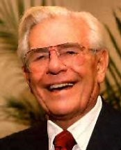
First of all, thanks to Jim for joining us here, and helping to make the mundane magical! I’ve known Jim for a loooooong time – we met my freshman year in college, <cough> years ago, through a mutual friend. I served as an early sounding board for some of Jim’s early Star Trek fanfic (you knew I’d mention that, didn’t you?:)) and later, as a beta reader for his first efforts at publishing crime fiction. Jim returned the favor and gave me some good advice for Time’s Enemy, and assured me that, yes, Tony indeed thought and acted like a guy.

So let’s dig a little deeper, and take a look at what makes Jim – and his characters – tick:

Jim, you’ve been published before by a small press. Your novel, Northcoast Shakedown, was a crime fic piece that I really enjoyed, even though that’s not a genre I read a lot. Please share your publishing experience with us:

Well, when I signed, the publisher was full of energy, and everyone on the roster became everyone else’s cheerleader. There were some hiccups getting Northcoast out, but it was a fun ride. And at the time, I had some money to spend on travel, so I used that to beef up my networking and get to know authors and booksellers. That first year was fun.

The second year was not so fun, but when any business goes under, there’s no clean way to sever ties. It’s too bad, because I really thought they could do something or be a decent launchpad for a lot of the writers. I think that’s true of a lot of small presses when they overreach. I remember UglyTown did not go quietly, despite both the publishers’ and authors’ best efforts, and Point Blank just sort of faded away. But for a short time in the middle of the last decade, it was a wild ride.

There are two more books featuring Nick Kepler, the protagonist of NCS, both of which I also beta-read and really enjoyed. I remember reading Bad Religion at work during a slow period, and having to restrain myself from laughing out loud. IMO, these books deserve to see publication, and NCS deserves another chance. Now that you’ve gone indie, do you have any plans to (re)release them?

Northcoast will definitely be out later this year. Noir master Ken Bruen wrote me a very nice intro, and I found out it was sitting on a shelf he uses for quotes when he writes. So I was very touched by Ken’s intro. He’s been one of my mentors for years, and I have one project under wraps that will bear his name on the dedication page. I’m not saying which one.

The second book, aptly titled Second Hand Goods, is going to get a rewrite and a fresh edit. I’ve evolved as a writer, and since its collected cyberdust for the last five years, I can look at it a bit more objectively.

Bad Religion is just screaming for some fresh material based on my experiences since the early drafts. I’ll likely downplay Nick and Elaine somewhat to focus on some of the other characters.

Road Rules coverWhich brings me to your new release, Road Rules. This book has a history of its own, including snagging an agent’s interest. Can you share a bit of that with us?

The seeds of Road Rules have been around for some time. Tim Mason was the earliest. A mutual acquaintance of yours and mine introduced me to this weird coworker. I’d toyed with making him a lawyer in a standalone (picturing Seth Green in the part) and a thorn in Kepler’s side, a role eventually taken by the Eric Teasdale character.

A couple years later, my publisher and I kicked around the road trip idea. I wrote a short sketch about two guys in a stolen Cadillac trying to get to Miami. Tim Mason sort of attached himself to the story.

After I got orphaned, a few friends prodded me into doing NaNoWriMo in 2006. So I fleshed out the story, hit on the idea of the decadent, yet spiritual drug lord, Julian Franco as the cause of all this chaos, and boom! The story demanded to be written.

Road trip stories are always fun! I love your tagline, “The road to hell begins with a stolen car.” But what really pulled me in were the characters. Were there any particular events, places, things you saw/heard/read that inspired the overall premise of the book, its events, or any of the characters?

The route they took was once the “long way home” from Hilton Head, SC, over a few years last decade. And having visited Savannah a few times in the process left me longing to write something set in that city. I still wanted to write about Cleveland, where I-77 begins, so the setting fell together easily.

I saw a few shows on History about holy relics and one of those true crime things about the theft of one such relic. Put those together in a city with a large Slavic population and you get St. Jakob.

Mike is based on years of working in the insurance industry. Maybe too many years. And Cinnamon was part of my desire not to have a bunch of macho white guys hosing the freeway down with testosterone. Plus, instead of the angsty tarnished knight, she’s someone just trying to prove herself.

Back in May, you released your first indie title, a short story called “A Walk in the Rain” (also a good read). What made you decide to go indie?

Well, crime doesn’t really pay well. Of course, I’ve got a short story in West Coast Crime Wave coming out this month from Bstsllr.com, which I did get paid for, but the paying markets are few and far between. I decided to get paid for my short work. I also found out that 1.) It’s the cover, stupid (though content still rules), 2.) people don’t really buy a lot of short fiction on Amazon unless it’s a collection, and 3.) it might help if you actually market an ebook.

(Jennette: A Walk in the Rain is available at Amazon for $0.99.)

Now that you’ve tasted the control and flexibility that comes with indie publishing, are you still pursuing a traditional publishing contract, or perhaps another agent?

I think eventually, I’d like to go traditional, but only under certain circumstances. I’m in a position now where I don’t have to make this a career. So the terms have to be right, and I have to be able to keep control of material I’ve already published. But if the right deal can be worked out, sure, I’ll sign.

Are you planning to offer Road Rules in print?

If enough copies sell, I’ll put it on CreateSpace. If a publisher makes a sweet enough offer, I’ll seriously consider it.

Now that Road Rules is out, what’s next for Jim Winter?

Northcoast, as I said, will be coming out. And the other two Keplers will see revisions and fresh edits. Then there’s my “magnum opus,” which I’ve been reworking since the original draft checked in at 105,000 words.


Thanks again for being here, Jim! And to everyone else, Road Rules is a fantastic, fun read that you owe it to yourself to check out, even if you don’t normally read crime fiction. It’s a fast-paced caper that will keep you reading – and laughing – all the way from Ohio to Georgia, along with Mike, Stan, and Cinnamon. Road Rules is available in your choice of e-formats for a knockout price of $ .99 at Amazon, Barnes & Noble, and Smashwords.

Jim keeps a fun, entertaining blog at http://eviljwinter.wordpress.com where he writes about books, publishing, sports, Cincinnati, technology, and whatever else strikes his fancy.

Anyone have questions for Jim? Feel free to ask, or just comment to say Hi!

Time Management: Do It First, DUH

My time management plans have been a bit challenging lately. The main reason for this is that I have several ongoing tasks on my plate that each need more time than the allotted hour each evening. Some have fallen off the schedule, except sporadically – email and social media, for example. In some cases, this was unexpected. An upgrade to my accounting software that should have been easy, ended up taking up a whole evening, ending with a lengthy tech support phone call (normally, a last resort for me). All ended up well, as the technician was actually able to help and we finally determined that the download sites I’d tried getting the software from, were both dishing up bad files. Still, that’s three hours I can’t get back.

Treadmill and netbook

Treadmill + good stuff to read on my netbook + DUH = Success!

One thing that amazingly hasn’t fallen off the schedule is my physical activity, which for the most part amounts to a thirty-minute interval workout on the treadmill. I’ll be honest here: I hate exercising. I like walking in and of itself, but I don’t like to sweat (which the interval workouts certainly do), I get easily bored, and I get stressed thinking of all the other stuff that needs to be done, that I’d much rather be doing.

So how have I kept it up?

Two things, actually. The first is something I learned several years ago in psychologist/author Margie Lawson‘s wonderful Defeat Self-defeating Behaviors online workshop: The DUH principle.

The DUH principle is pretty simple, and therin lies its beauty. Its three facets are:

  1. Do it first. Or at least, as close to first as possible. I’m sooooo not a morning person, so there’s no getting up early to exercise. Not gonna happen. So my “first” is first thing after I get home from work.
  2. Understand it might not be easy. This part I put out of my mind and Just Do It, even if I don’t feel like it (and I often don’t).
  3. Hurray! Celebrate your progress and success! I mark down my treadmill time in my food and exercise diary on my Android phone, and also on my workout site. I also have a Yahoo goals group, to whom I report my success each week.

The other thing that’s helped me is Make it Fun if at all possible. With a little help from my netbook, the Kindle for PC app, and tons of great books, my exercise time doubles as reading time – something all writers should do anyway. So knowing I’ve got a good book to read just waiting on my netbook is a great incentive, and helps me get past the I-don’t-feel-like-its. It really makes that half hour zip by. Years ago, I tried reading print books on the treadmill. Didn’t work. My treadmill has a book slot on its control panel, but the panel is way too high for me, and it’s too low a slant. It was also a pain to turn pages. The netbook holds the book at the perfect angle, and turning the page is just a tap on the page-down button.

Got any good tips on getting an un-fun task done? Please share! And if you’re having trouble, try the DUH principle – and see if you can make that drudgery fun!

Little Details in Books: Do You Notice Them?

I’m not talking about story details; I’m talking about little, visual details – graphics, chapter headings, fonts.

I’ve been thinking about these details a lot because now that Time’s Enemy is out in digital format, I’m starting to work on the print version.

There are a lot of extra considerations to make when planning a print version. There’s a lot more to creating a print cover, but there are also many decisions for the book’s interior. Foremost is which font to use for the body text? And yes, there is life after Times New Roman. I considered Garamond, Palatino, and Book Antiqua, but finally settled on Caxton. It’s a really pretty font, is sort of a combination of old style with a modern flair, and gives the page a nice, even “color.” The main thing you’re looking for is readability, and for body text that’s going to be printed, that usually means a serif typeface. For those unfamiliar with graphic arts terms, “serif” means the typeface has little brackets on the ends of the letter strokes. All the fonts I’ve mentioned above are serif typefaces. Sans-serif fonts (i.e., fonts without serifs) include Arial, Verdana, and Trebuchet, and are better suited for headings or on-screen reading, such as web pages.

The print version of Time's Enemy is set in Caxton, with right-justified chapter headings

The next consideration is display type, or what font to use in chapter headings and on the book’s title page. This is a good place for decorative fonts, and book designers can have a lot of fun with these. For my print book, I’m leaning toward Belwe, which is the same display font as the title on the book cover. Chapter headings are typically centered, but not always, and I liked the way my chapter headings look right-aligned, with a thin border beneath. Some books spell out “Chapter One,” while others just say “One” or even just have the numeral: 1. And finally, some feature small graphics, or glyphs, beside, above or below the chapter heading.

Robin D. Owens' Heart Thief has a lovely little glyph under the chapter heading, and the first line in italics. Threshhold, by Sara Douglass, featurs drop caps and a nice glyph above the chapter headings

Another thing to consider is how to treat the initial characters and/or line of text in a chapter or scene. Drop caps? First line in italics? First line in small caps? I’ve seen all of these done by big publishers, and it’s a nice way to set off the beginning of a chapter or scene. I didn’t care for the way drop caps looked in my book, and small caps wasn’t as uniform in appearance as I’d like, so I went with italics. Of course, there are other considerations like page size, margins, headers, and so on, but those are subjects for anotherblog (or several).

Threshhold, by Sara Douglass, featurs drop caps and a nice glyph above the chapter headings

Then there are glyphs. I loooooooove glyphs – those little, deccorative images that sometimes display with chapter headings, or between scenes. I didn’t think they’d be practical to do in eBooks, but then happened upon a wonderful book with awesome little glyphs between scenes, so I knew I had to have them in my book, too! What’s really cool is when the image directly relates to the story, as is the case in both of Cate Rowan’s books, as well as mine.

Kismet's Kiss glyph

The scimitar is an important prop in Cate Rowan's Kismet's Kiss


Saturn Society logo

A tiny Saturn Society logo separates the scenes in my books

If a book is typeset in an unusual font, or has glyphs separating scenes or with chapter headings, I notice. I figure this is due to my background in graphic design, but maybe not – do you notice little details like this? Got any examples to share of particularly attractive chapter headings, or scene separation glyphs?

Oh, and by the way, these are all awesome books! For some reason, I’m either into fantasy romance right now, or maybe those are just the kind of books that are more likely to feature these design details. Pretty pictures or not, Heart Thief, Threshhold, and Kismet’s Kiss are fantastic books. If this is your kind of story, I encourage you to check them out. And of course, I’d love for you to check out Time’s Enemy!

My Town Monday: The Little Things

One of the fun things about writing (and reading) time travel stories is the whole fish-out-of-water aspect, especially when someone goes into the future. There is one scene in Time’s Enemy, my newly-released time-travel novel, where a character from the 1930s comes forward to modern times. When she asks for a drink and is handed a can of Mountain Dew, she’s understandably perplexed at what to do with it (and initially thinks it’s moonshine, LOL).

Anyone remember drinking beer or pop (“soda” for you non-Midwesterners) from a can like this? Younger folks might not, but in the sixties, seventies, and into the early eighties, this is what you got if you bought beer in a can, or got a Coke, Pepsi, etc. from a machine. Of course, I also remember pop in glass bottles – you know, where you bought a six pack at Kroger and paid a deposit of $.05 – .10 per bottle, which they returned when you took the bottles back to the store.

But back to the cans – before they were like this, they required a can opener, like is still used today to open larger cans of juice, although those are now mostly replaced by bottles. The can opener had a sharp point on it, and poked a triangle hole in the edge of the can. A second hole was needed to admit air.

Dayton inventor Ermal Fraze

The pull tab shown on the can to the right came about in the early sixties, after Dayton tool-and-die maker Ermal Fraze went on a picnic, and forgot to bring a can opener for the drinks. According to the stories, he ended up prying cans open on a car bumper (???), then went home and devised a can with a built-in opener – the pull tab.

The pull tab was eventually superceded by the now-familiar push-in top in the eighties, but it was the pull tab that helped push cans to edge out glass bottles in popularity as a beverage container. Fraze’s legacy lives on today in the form of full-top pull tabs that are still commonly used in canned snacks like peanuts. Dayton Reliable Tool (now DRT Mfg.), the machine shop he formed in the 1940s, is also still in business in Dayton today.

Do you know of any cool little details that we take for granted today, that originated in your hometown? Please share!

More at the My Town Monday blog

Sources: http://en.wikipedia.org/wiki/Beverage_can
http://web.mit.edu/invent/iow/fraze.html
http://www.heartlandscience.org/manuf/poptop.htm

Photo of beer can via Wikipedia, public domain
Photo of Ermal Fraze via Heartlandscience.org